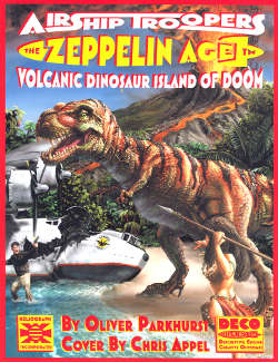
If you're in the mood for some old-school roleplay gaming in a pulp-adventure milieu set between 1900 and 1940, why not try Airship Troopers: Volcanic Dinosaur Island of Doom by Oliver Parkhurst, the first release of the Zeppelin Age line. (NB: The publisher, Heliograph, sent me a free copy because they used my font, Duarte Juramento, for some of the illustration labels.)
As the name implies, the game centers around airships and exotic island locations (I assume future installments of the promised Zeppelin Age series will have airships in other scenarios). I'm not an RPG player so I can't comment too much on Heliograph's DECO System: it uses dice; is run by a Director; has Moxie Checks when your character takes damage; awards Pavlov Points to reinforce entertaining roleplay; and defines characters by Trademarks, Motivations, and Hooks.
While in our reality Zeppelins were never that successful, Airship Troopers imagines a world where they are a major form of transportation. The difference that makes this reality possible is Monarch Airways, owned by wealthy and forward-thinking Ozma Tippitarius, whose mysterious sources of funding and helium keep the airship industry aloft and thriving. The titular Airship Troopers handle Monarch security and are able to deploy from airships thanks to Rocketeer-style rocket-packs called Firebirds. Well, they actually deploy thanks to gravity; the Firebirds let them get back.
Besides the Monarch backstory, there's lots of interesting info on real Zeppelin history, technology, and operations, including a Zeppelin Owner's Operation Manual (or Z.O.O.M.). While your Zeppelin can fly for days without fear of crashing, maintaining neutral buoyancy isn't as easy as one might suspect. If you deploy personnel or cargo, you loose their weight and must compensate by venting gas, of which you only have a limited supply. If they return, you must then drop water ballast, which again is limited. Going up and down relatively quickly also means expending gas and ballast. Unless your engines are running on Blau gas, using fuel decreases weight and requires gas venting. Environmental conditions can affect the effectiveness of the gas, requiring adjustments to the gas/ballast ratio. Balancing these two resources without running too low on either to safely control the ship necessitates skill and experience.
To explain the day-to-day operations of Zeppelins, the book introduces Monarch Airways' experimental testbed, the MAA Zenobia, which was retrofitted from the real-life R-80. Included are a blueprint, walkthrough, and descriptions of crew duties.
Being transportation, airships aren't very useful unless you have somewhere to go. Where you choose to take your airship in your game is up to you, and the book's outline of the DECO system and airship info can serve to build any Zeppelin Age adventure you want. But as you've guessed from the sub-title and Chris Appel's cover art, Parkhurst has some ideas of where your Zeppelin should be headed.
Welcome to the Volcanic Dinosaur Island of Doom (or just the Island)!
The Island is an environment filled with pulpy goodness for your Airship Troopers to explore and be killed by. And yes, there are dinosaurs. You could even play as a dinosaur; the character section suggests Uncommon Descriptions that include not only a Wonderdog (à la Rin-Tin-Tin) but a Wondersaur (T. Rex-Tin-Tin?), and there's a Wondersaur named Sandy described in an example adventure in the Director's section.
All the pulp staples are here: lost cities, mad scientists, gangsters, jungle girls, Neanderthals, giant arthropods, man-eating plants, weird fungi, Nazis, the Red menace. Of course, not everything listed has to be on your game's version of the Island. They're all just suggestions. The example adventure provides character/creature stats for a number of them, but it's easy to create your own.
Of particular interest to my readers, the Island is potentially home to a menagerie of terrestrial cephalopods: lakeside croctopus, giant elephantopus of the grasslands (reminiscent of the Umbrella Beasts from "The Octopus Cycle", as seen on this pulp cover [UPDATE: more about it here]), cave-dwelling stalactopus and stalagmopus, airfaring zeptopus, and naturally forest-dwelling treetopus. Since there's already Wondersaurs, perhaps you'll consider playing as a plucky arboreal Wonderpus sidekick. Also, the mixture of tree octopuses and dinosaurs means this will happen.


